Friday, September 26, 2014

The Emergence of Modernism
By: Katie Kaywood
 
The international style is a major architectural style that emerged in 1920s and 1930s, the formative decades of Modern architecture with an emphasis on horizontal design elements that focused on clarity and force. One of the major architects in this time frame was Frank Loyd Wright he used lots of influences from Japan in this designs.

There are three main principles developed in this modernism, by Hitchcock and Phillip Johnson. There were:
-volume rather than mass,
-the emphasis on balance rather than preconceived symmetry,
-and the expulsion of applied ornament.

This International style is a style we are seeing throughout the world, in our eyes  known as the modern style. This style started in Western Europe, and had concerns of making use of the industrial technology as well as hand craft traditions.

The style had radical simplification of form, a rejection of ornament and adoption of glass, and concrete as preferred materials. It also used wood metal textiles and the use of primary colors. (red, yellow etc.) The Movement's style caused disruption with the government, they were not too keen on the design as well as the timing because of a war going on. There were four major architects in helping produce and extend this design: 

1. Walter Gropius, his style was unornamented functional and had an industrial feel


2. Ludwig Mies Van der Rohe, his motto was "less is more." His use of colors and textures of rich materials provide ornamentation throughout his designs. He built the first building that fully exploited modern structural technology using steel and concrete.

3. Mies Van Der Rohe, he built a house through which you could see the nature around you. (glass house) called the Farnsworth House in Illinois and he also believes less is more.


4. Lastly Le Corbusier, A designer with a passion for classical Greek architecture and an attraction to the modern machine. He published his ideas in a book entitled Vers Une Architecture, in which he refers to the house as a :machine for living: an industrial product that should include functional furniture or "equipment de I 'habitation."

When learning more about the emergence of modernism by reading my colleagues blog, I was interested in Nichole Kropsias take on each of the designers take on the era and their own use of creativity and in their designs, granted they all have similarities but her understandings of how different each designer used each attribute/design element was interesting and more clear to understand and differentiate.

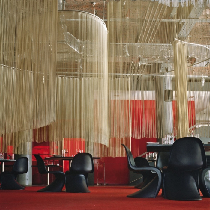
Here is some current applications:

 
For more information on the emergence of modernism and any of the information presented above check out this video: http://education-portal.com/academy/lesson/modernism-in-american-literature.html#lesson

Sunday, September 7, 2014

Deutscher Werkbund Movement
By: Katie Kaywood
 
Flash Back in the Past of Design:


The Deutscher Werkbund movment was a German association of craftsman; artists, architects, designers, and industrialists. It started in the late 1800s and was founded in Munich, Germany.

This movement was the development of modern day architecture and industrial design, its purpose was to establish a partnership of product manufacturers to improve the competition of German companies. It integrated traditional crafts and industrial techniques that allowed Germany to compete against England and the United States.

This movement was similar to the Arts and Crafts Movement. It was a protest against the artistic establishment and had set the stage for the international style and art deco style. The collaboration between design professional with product manufacturers helped improve competitiveness of German design. 

The Deutsche Werkbund association were determined on changing Germany as a world power and bringing the culture of art and creation to the focus of German life. They saw little distinction between architecture, art, and print, this started to infiltrate into product design.

The Vienna secession and Werkbund pronounce influence on Bauhaus Designers, the Vienna group included Josef Olbrich, Gustav Klimt, Otto Wagner, Adolf Loos, Josef Hoffmann and Koloman Moser.

 
The Vienna Secession building was an exhibition designed by Josef Olbrich. It was symbolically known for a "proto-modern" building. Josef Olbrich designed this building using geometric shapes and curvilinear artwork.
 
Along with Josef, Gustav Klimt was an Australian symbolist painter and used naturalistic qualities and curvature in his paintings. Also from Austria Otto Wagner believed in staunch functionalism, he designed furniture similar to Klimt with curvature and geometric shapes.
 
In this secession Adolf Loose was another designer that made his furniture hand made with natural qualities and curves. Josef Hoffman was another architect/designer that made furniture as well as textiles and did glass/metal work in this secession. He was very innovative and progressive with his designs. Lastly Koloman Moser, his designers were quite intricate. He made all kinds of furniture and patterns with geometric shapes, curves and natural.
 
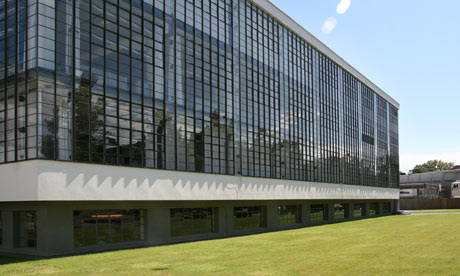
All of these designers had the same ideal in their designs and architecture, they were powerful and beautiful. They used geometric shapes, curves, naturalistic qualities and symmetry when producing their creations. Here are a few applications:


Current Application:


When reading Ali's blog and I really like her examples of the current applications. Her choice of images were very helpful with addressing each characteristic that is the Deutscher Werkbund Movement. Ali's blog also showed great examples that demonstrated the differences and similarities of the furniture that was constructed during this time period.

For further information watch this video:
https://www.youtube.com/watch?v=Eyjr9kn9dLE