Sunday, November 9, 2014

Contemporary Design : Post Modernism
By: Katie Kaywood
 
 
Post modernism made it easier for people to communicate their design strategies, it increased the speed of communication through magazines, books and television as a result design work then became more of an international profession and replaced international style. Two major influential architects in this period were Louis I Kahn and Cesar Pelli.
 
 
Louis I. Kahn graduated from the architectural school of the University of Pennsylvania in 1924 and then went on to teach at Yale and then back to the University of Pennsylvania. His work was different from anything else that we have seen,  he expressed his emotions through materials and lighting design techniques that reveal forms and creates the nature of interior spaces. Here is one of his works that I thought was pretty amazing: Jatiyo Sangshad Bhaban, National Parliament House, Bangladesh.


Cesar Pelli was an Argentine/American influential architect that designed some of the worlds tallest buildings. He was the Dean of University of Yale school of Architecture. Some of his major works included : U.S. Embassy in Tokyo, The Museum of Modern Art in New York, the NNT Building in Tokyo, and the tallest building in the world the twin towers of Pelli Petronas Center, Kuala Lumpur.
 
Tallest building in the world


Contemporary design : Hi- Tech
New technology was one of the prime basis of modern design, steel, concrete and glass. This design stylized concept was very geometric, a major designer that influenced this was Richard Buckminister Fuller - he made a hemispherical dome structure using triangulated units.
 
U.S exhibit Pavilion at Expo 67
 
Contemporary Design/ post modernism design is become more green and more high tect, it rejects the aspect of being wholly modern to using the basic starting blocks of modernism and creating something with unique architecture through out.
 
Current applications :


After reviewing Paige's blog I like how she incorporated how this time of design involved green design, it thought about what it was doing and really made improvements for our environment and our society. I also reviewed Natalie's blog she incorporated great images with her descriptions of the three major influential designers. It really helped describe the designers style and his motives with the use of descriptive images.

Here is a video to learn more: https://www.youtube.com/watch?v=lKomOqYU4Mw


Sunday, November 2, 2014

Rise of the Decorator
Art Deco and the rise of the interior Decorator
by: Katie Kaywood
 
 
Contributors to the World's Fair fell into two distinct categories, functionalists and decorators. This rise began in Paris during the art deco period. Interior decorators were growing and in need of wealthy class people for houses that reflected status, including professionals to help with outfitting the interiors. Three prominent and influential designers helped with the rise of interior decorating.
 
Elsie de wolfe did just that, she restored Victorian interiors into light and bright spaces using French furniture and helped interior design become a separate entity from architecture.
 
Her motto is: "I want to make everything around me beautiful- that will be my life"
 
Another woman that helped with interior design is Dorothy Draper. She used traditional furniture and used it in a non-traditional way helping add a fun and appealing style. She was well known for her dramatic use of black and white on walls, floors and upholstery. You could say her style was known as "modern baroque." One of her most well known pieces of art was the Greenbrier Hotel.


Lastly Billy Baldwin, in the rise of decorating/decorators he was a big influential person. He designed for the middle class as well as many famous architects. He disdained the florid, baroque and rococo in favor for a more clean cut, hard edged and pared-down design.
 
Billy Baldwin's motto is: "Nothing is interesting unless it is personal."
 
Current Applications:
 

After reading Natalie and Justine's blog I was more knowledgeable about Elsie and Dorothy and what they did for the community. They wrote books and opened schools helping make interior decorating that much more important and well known today.
 
For more information On Dorothy Draper's designs you can watch this video:https://www.youtube.com/watch?v=m7_cycJBTPg


Tuesday, October 28, 2014

Continued Modernism in America
by: Katie Kaywood
 
 
The most successful architects and designers in this phase were using the dominant movement of electric historicism. These were based on the concepts of Paris Ecole des Beaux-Arts. The work by Sullivan and Wright were commonly overlooked and European modern works were rarely ever published, therefor unknown.
 
Frank Lloyed Wright's approach to modernism was extremely famous, he created a number of beautiful homes, here are a few below.
 
Frank Lloyd Wright and Aline Barnsdall in the 1920s and 1930s designed the Hollyhock House in Los Angeles, California. It became a monumental structure of poured concrete and geometric ornament.


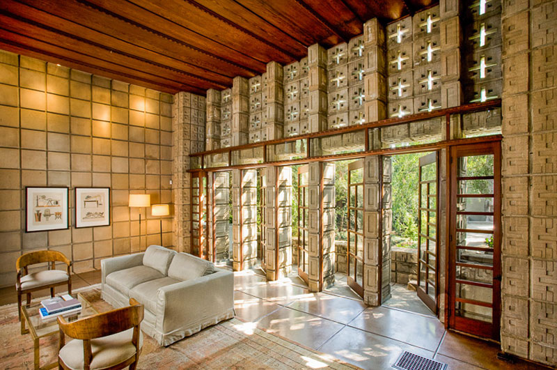
 Another exquisite house in this continuing modern phase is La Miniatura in Pasadena, California. It is the most successful of houses made in this period, the patterned face gives the wall surfaces a repeated pattern.  


The last one I am going to show is the house called "Falling Water." It is on of Wrights most strategic and beautiful creations. This house was set directly on top of a waterfall instead of across the waterfall, the geometry and build of this home is extremely prestigious and incredible.
 
 
A few other amazing artists, designers, architects etc. in this period were Rudolph Schindler from Austria, Richard Neurta also from Austria, William Lescaze - he brought European modernism ideas into America in 1920s, Philip Goodwin and Eward Stone - great designers, they made modernism visible to the New York public, Walter Gropius, Marcel Breuer, Mies Van der Rohe, Philip Johnson, and Eero Saarinen. All of these people made modernism continue in America and become a very well known and beautiful period of design and architecture. Here are a few examples of what some of these designers made:
by Eero Saarinen - Kleinhans Music Hall
 
by: Philip Johnson - Glass House
 
by: Richard Neurta - Kaufmann House
 
All of these spaces are beautiful and unique.
 
Modern Current Applications:


After reading Emily's blog I was informed more on the falling water house because she went into great detail about how it was her favorite and how detailed the architecture placement was. I also reviewed Megan Yee's blog, she went into further detail background on Irving Gill and Rudolph Schindler and their designs of both the Dodge and Schindler houses.  
 
For more information of continued modernism into America and further background on the Glass house by Philip Johnson you can watch this video : https://www.youtube.com/watch?v=azUBFQhG1nk
 

Sunday, October 5, 2014

Art Deco
By: Katie Kaywood
 
 
Art Deco was in France in 1925, it came to the United States and other European Countries at the beginning of the world war II. It was a fashion oriented style, strongly decorative and was influenced by Art Nouveau. The public was hesitant to accept this design style because of its timing with the war. The main architect of Art Deco was Michel Roux-Spitz from Paris. In his art deco design he often used chevron shapes, zig-zags, African tribal art, large mirrors and prominent light fixtures that drew a lot of attention to its modern materials.  

 
Art deco design was not only abstract shapes but also was used with rich materials such as; ebony, tortoise-shell, zebrawood with inlays of ivory, polished metals, leather, and glass. Which helped make the design rich, bold and extravagant. One of the art deco designers that used such materials in his furniture design was Jean Dunand. In his design he used geometric forms in the 1920s when he produced screens, cabinets, chairs, and tables.
 
A designer in this period named Eileen Gray stuck out to me, she was very original in her designs in furniture that really caught my attention, her work was beautiful. She was an expert in lacquer before World War I, she also did lamps and colorful geometric rugs. Her chairs designs had great dimension and stuck out from your normal chairs.
 
Art Deco isn't just furniture, it is throughout the entire room. It can be on the floor, on the walls, in the carpet or in the textile used. The most distinct attribute of this design is its use of crazy shapes, zig-zags, stripes, plaids, colors and cubistic themes like I stated shortly above. A very well known designer for this is Sonia Delaunay.
 
When Art deco came over into the US three major designers were Paul Frankl, - he introduced plywood instead of using solid wood in his designs, Joseph Urban, and Frederick Kiesler. All three amazing designers that brought new additions to the Art Deco design.
 
What kept the design carried on was the invention of the Radio and it helped carry art deco into every American home. The New York Rockefeller Center was designed in this Art Deco period in 1935 as well as 19 other commercial buildings. 

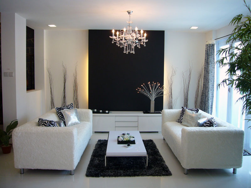
This style of design is still pretty prevalent today, I see it everywhere in wallpaper designs, floor designs, furniture etc. I feel it is used a lot in modern style spaces through pillows or subtle features that really pop out.
 
Current Applications:
 
When reading Natalie and Justine's blog I learned more about how prevalent and wide ranged the Art Deco furniture is and still is used today. In Natalie's blog she showed a lot of different designers chair/ furniture designs as well as discussed the style of each helping distinguish the true style and common features of the Art Deco style.
 
Here is a video to learn more on Art Deco :) https://www.youtube.com/watch?v=amVvYPU4Gw8


Friday, September 26, 2014

The Emergence of Modernism
By: Katie Kaywood
 
The international style is a major architectural style that emerged in 1920s and 1930s, the formative decades of Modern architecture with an emphasis on horizontal design elements that focused on clarity and force. One of the major architects in this time frame was Frank Loyd Wright he used lots of influences from Japan in this designs.

There are three main principles developed in this modernism, by Hitchcock and Phillip Johnson. There were:
-volume rather than mass,
-the emphasis on balance rather than preconceived symmetry,
-and the expulsion of applied ornament.

This International style is a style we are seeing throughout the world, in our eyes  known as the modern style. This style started in Western Europe, and had concerns of making use of the industrial technology as well as hand craft traditions.

The style had radical simplification of form, a rejection of ornament and adoption of glass, and concrete as preferred materials. It also used wood metal textiles and the use of primary colors. (red, yellow etc.) The Movement's style caused disruption with the government, they were not too keen on the design as well as the timing because of a war going on. There were four major architects in helping produce and extend this design: 

1. Walter Gropius, his style was unornamented functional and had an industrial feel


2. Ludwig Mies Van der Rohe, his motto was "less is more." His use of colors and textures of rich materials provide ornamentation throughout his designs. He built the first building that fully exploited modern structural technology using steel and concrete.

3. Mies Van Der Rohe, he built a house through which you could see the nature around you. (glass house) called the Farnsworth House in Illinois and he also believes less is more.


4. Lastly Le Corbusier, A designer with a passion for classical Greek architecture and an attraction to the modern machine. He published his ideas in a book entitled Vers Une Architecture, in which he refers to the house as a :machine for living: an industrial product that should include functional furniture or "equipment de I 'habitation."

When learning more about the emergence of modernism by reading my colleagues blog, I was interested in Nichole Kropsias take on each of the designers take on the era and their own use of creativity and in their designs, granted they all have similarities but her understandings of how different each designer used each attribute/design element was interesting and more clear to understand and differentiate.

Here is some current applications:

 
For more information on the emergence of modernism and any of the information presented above check out this video: http://education-portal.com/academy/lesson/modernism-in-american-literature.html#lesson


Sunday, September 7, 2014

Deutscher Werkbund Movement
By: Katie Kaywood
 
Flash Back in the Past of Design:


The Deutscher Werkbund movment was a German association of craftsman; artists, architects, designers, and industrialists. It started in the late 1800s and was founded in Munich, Germany.

This movement was the development of modern day architecture and industrial design, its purpose was to establish a partnership of product manufacturers to improve the competition of German companies. It integrated traditional crafts and industrial techniques that allowed Germany to compete against England and the United States.

This movement was similar to the Arts and Crafts Movement. It was a protest against the artistic establishment and had set the stage for the international style and art deco style. The collaboration between design professional with product manufacturers helped improve competitiveness of German design. 

The Deutsche Werkbund association were determined on changing Germany as a world power and bringing the culture of art and creation to the focus of German life. They saw little distinction between architecture, art, and print, this started to infiltrate into product design.

The Vienna secession and Werkbund pronounce influence on Bauhaus Designers, the Vienna group included Josef Olbrich, Gustav Klimt, Otto Wagner, Adolf Loos, Josef Hoffmann and Koloman Moser.

 
The Vienna Secession building was an exhibition designed by Josef Olbrich. It was symbolically known for a "proto-modern" building. Josef Olbrich designed this building using geometric shapes and curvilinear artwork.
 
Along with Josef, Gustav Klimt was an Australian symbolist painter and used naturalistic qualities and curvature in his paintings. Also from Austria Otto Wagner believed in staunch functionalism, he designed furniture similar to Klimt with curvature and geometric shapes.
 
In this secession Adolf Loose was another designer that made his furniture hand made with natural qualities and curves. Josef Hoffman was another architect/designer that made furniture as well as textiles and did glass/metal work in this secession. He was very innovative and progressive with his designs. Lastly Koloman Moser, his designers were quite intricate. He made all kinds of furniture and patterns with geometric shapes, curves and natural.
 
All of these designers had the same ideal in their designs and architecture, they were powerful and beautiful. They used geometric shapes, curves, naturalistic qualities and symmetry when producing their creations. Here are a few applications:


Current Application:


When reading Ali's blog and I really like her examples of the current applications. Her choice of images were very helpful with addressing each characteristic that is the Deutscher Werkbund Movement. Ali's blog also showed great examples that demonstrated the differences and similarities of the furniture that was constructed during this time period.

For further information watch this video:
https://www.youtube.com/watch?v=Eyjr9kn9dLE